KAUS INSURANCE
AN INSURANCE COMPANY LOOKING TO MODERNIZE WITH A RESPONSIVE E-COMMERCE SITE GEARED TO A YOUNGER TECH-SAVVY MARKET
Project Overview
About Kaus
Kaus is a large insurance company, well-established in the insurance industry for over 30 years. It has a large portfolio of 350+ different pre-packaged insurance policies that are priced lower than its competitors. To date, it has been selling its products through regional agents.
Kaus PROJECT Goals & Requirements
Kaus is looking to appeal to a younger tech-savvy market with a new online direct-to-consumer responsive e-commerce website. The website must simplify insurance selection and be easy to navigate. Additionally, Kaus would like a refresh of the brand to reflect its new focus.
Design Requirements
/ Responsive e-commerce website
/ New branding & logo
Role
Research, design, branding, prototyping & testing
[Kaus is a conceptual project]
1/ Research
Featured: Secondary Research | Primary Research
Secondary Research
I began my process with secondary research to gain an understanding of the target market, the industry and its trends. I wanted to learn about the millennial market, millennial behavioural patterns and life patterns that would affect millennials’ decision-making for insurance, as well as insurance in general in Canada.
I completed a competitive analysis to understand the strengths and weaknesses of the key competitors. I also looked at comparative industry players to see what they were doing well and what they could do better.
Primary Research
I conducted user interviews with participants of the millennial and younger generation x age groups, who all had previously purchased at least one type of insurance. I sought to understand their behaviours and frustrations in choosing and buying insurance, and to identify patterns in these in order to inform my design process.
2/ Define
Featured: User Persona | User Flows
User Persona
I developed the user persona Brittany based on patterns I had identified through my user research in order to represent the behaviour and goals of a group of users. Along with an empathy map and a storyboard, the user persona allowed me to develop a deeper understanding of the user’s needs and who I was designing for.
User Flows
After developing the sitemap, I mapped out the common user flows of a new user: Arriving to the website via different avenues and landing on different pages, using the learning resources and planning tools, registering an account, completing a purchase of insurance, or saving an insurance quote for later.
3/ Interaction Design
Featured: Low-Fidelity Sketched Wireframes | Mid-Fidelity Wireframes
Low-Fidelity Sketched Wireframes
I took to sketching to explore preliminary concepts for the landing page, varying the organization of content while ensuring the inclusion of the key components identified as priorities through my research and by the project brief.
Mid-Fidelity Wireframes
I created mid-fidelity wireframes to prepare for content, building on concepts explored in the low-fidelity sketched wireframes.
4/ User Interface Design
Featured: Brand Logo | Brand Style Tile | Responsive UI Designs
Brand Logo
I chose a strong, geometrical font with heavy lines and round shapes for the new brand logo for Kaus, with the goal of communicating confident, trustworthy, modern, non-intimidating, and easy. The upper part of the ‘k’ and the upper part of the ‘a’ form a check mark with the check mark signifying that Kaus can be checked off for being a trusted company; the check mark also functions as a check mark to say “check, you’re covered!”. The upper part of the ‘a’ forms a cover, symbolizing the coverage and protection provided by insurance.
Brand Style Tile
After researching the logos and branding of other insurance companies, I set out to choose a colour palette that would allow Kaus to stand out against its competitors. Keeping with a brand style of modern, fresh, friendly, easy, and fun, I developed a brand style tile for Kaus that included the new logo design, typography, colour palette, iconography, and imagery.
Responsive UI Designs
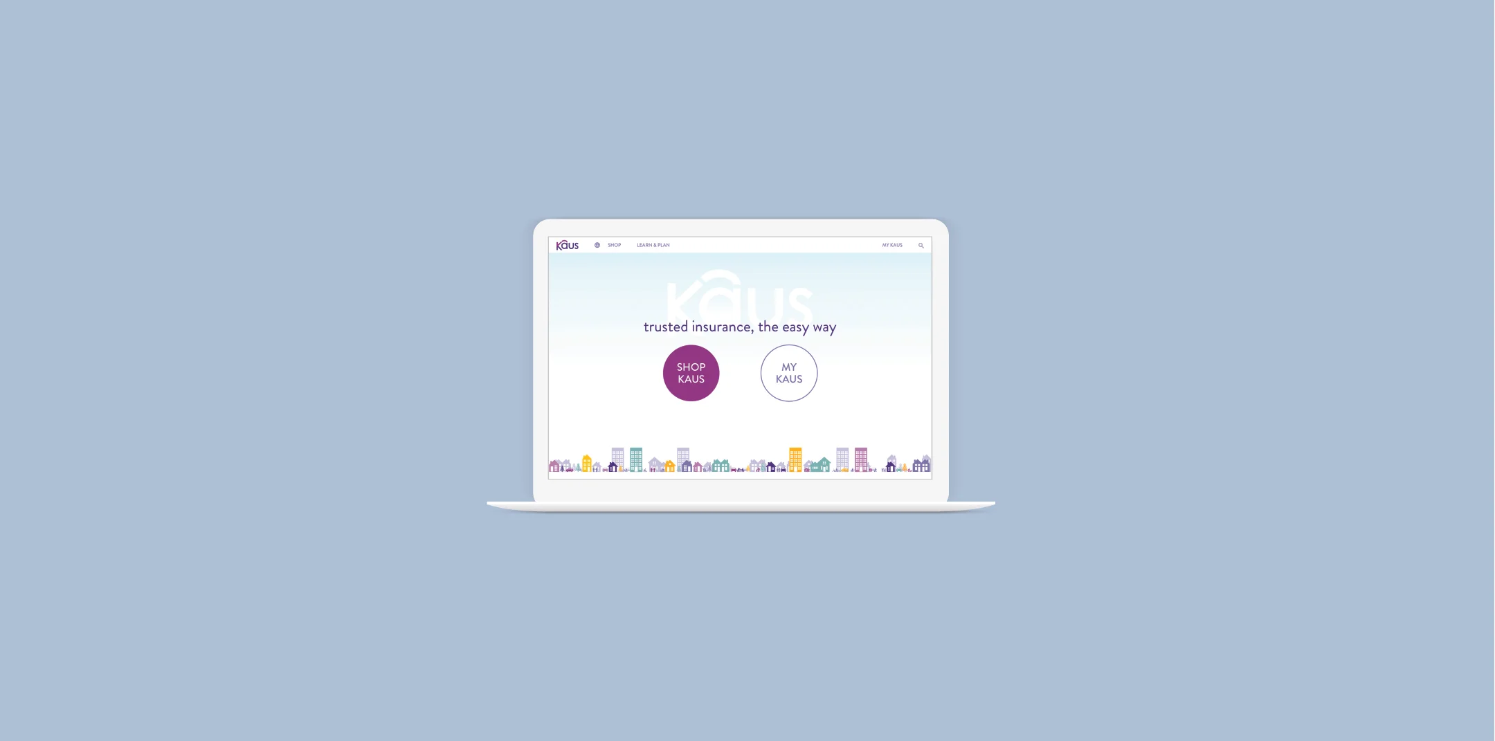
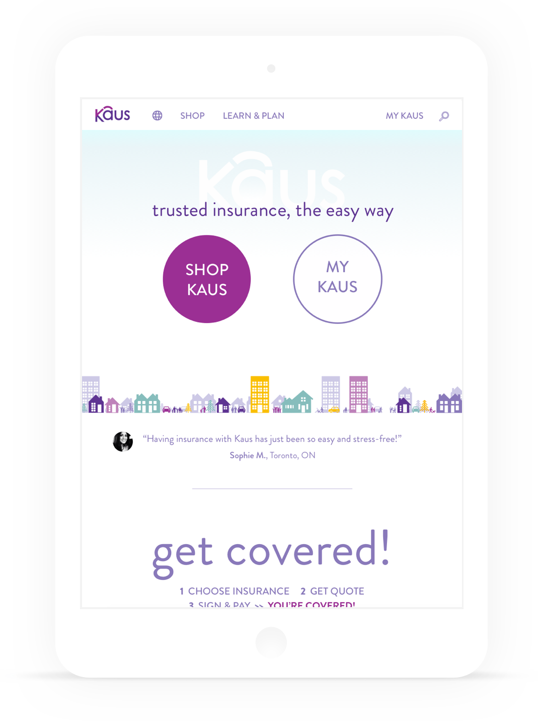
Using elements from the style tile and a UI kit, I created responsive designs that factored in the use of varying devices and orientations.
5/ Test & Iterate
Featured: Prototype
Prototype
I created a higher-fidelity, limited functionality prototype using Invision that included the full progression of actions required to complete the task set out for user testing: To get a quote for home insurance, get a quote for auto insurance, and complete the purchase for both.
Next Steps
With iterations completed on the existing pages in the prototype, next steps would include building out the remainder of the insurance product pages, the Learn & Plan pages containing learning resources and planning tools, and designing the My Kaus section of the site for existing customers to manage their accounts.
The Kaus insurance project was a great learning experience - it presented me with an interesting challenge of developing a design solution for a product and industry that is often perceived as complicated, doesn’t typically represent innovation, and isn’t generally enthusiastically regarded by its customers. By focusing on simplifying and clarifying the process, introducing a play element to the bundling process of selecting insurance plans, and using a simple, but colourful interface, I worked to improve the insurance buying experience for younger, tech-savvy users. Working on an e-commerce site for an insurance company was a valuable experience that also led me to learn the best practices of designing forms, shopping cart screens, and the checkout process - knowledge I can carry forward to future projects.


